
Welcome to the world of typography art, where words become not just a means of communication but a canvas for creativity. Typography, often overlooked, is a cornerstone of design that can make or break the visual appeal of any project. In this article, we’ll delve into the key principles of typography, explore its immense importance, and uncover how it can transform your designs into visually captivating works of art.
Table of Content
- Introduction
- Typography Unveiled
- Typography Defined
- The Art of Arrangement
- The Crucial Role of Typography
- First Impressions
- Enhancing Readability
- The Emotional Power of Fonts
- The Psychology of Fonts
- Choosing the Right Typeface
- Hierarchy and Visual Flow
- Establishing Hierarchy
- Flow and Rhythm
- Balance and Harmony
- Balancing Act
- Harmonious Combinations
- Consistency is Key
- Brand Identity
- Creating Cohesion
- Typography as Artistic Expression
- Typography as Art
- Pushing Boundaries
- Versatility in Design
- Adaptability
- Responsive Design
- Typography Tools and Resources
- Tools of the Trade
- Learning Resources
- Mastering Typography Art
- Typography Basics:
- Kerning:
- Leading
- Font Pairing
- Hierarchy and Scale
- Alignment & Consistency
- Mind the Line Length
- White Space:
- Consistency Across the Platform
- Conclusion
Typography Unveiled
• Typography Defined: Understanding what typography art is and how it goes beyond mere text.
• The Art of Arrangement: How typography involves arranging and styling text for maximum impact.
• Typography Defined: This section introduces typography, explaining that it’s not just about text but also the art of arranging and styling text for design purposes.
The Crucial Role of Typography Art
• First Impressions: Discuss how typography is often the first element noticed in any design.
• Enhancing Readability: Exploring how well-chosen typography aids in conveying your message effectively.
• First Impressions: Discuss how typography is often the first thing people notice in a design, setting the tone for their experience.
• Enhancing Readability: Explores how well-chosen typography improves the readability and comprehension of content.
The Emotional Power of Fonts
• The Psychology of Fonts: How different fonts can evoke varying emotions and moods.
• Choosing the Right Typeface: Tips for matching fonts to your design’s purpose and audience.
• The Psychology of Fonts: Examines how different fonts can evoke specific emotions and moods in the audience.
• Choosing the Right Typeface: Offers tips on selecting fonts that align with your design’s purpose and target audience.
Hierarchy and Visual Flow
• Establishing Hierarchy: How typography creates a natural hierarchy, guiding the viewer’s eye.
• Flow and Rhythm: Discuss how typography can set the pace and rhythm of your design.
• Establishing Hierarchy: Describes how typography creates a natural order in your design, guiding the viewer’s eye through content.
• Flow and Rhythm: Explores how typography sets the pace and rhythm of your design, influencing the way it’s perceived.
Balance and Harmony
• Balancing Act: How typography contributes to the overall balance of a design.
• Harmonious Combinations: Tips for pairing fonts and managing white space effectively.
• Balancing Act: Discusses how typography contributes to the overall balance of a design by considering factors like font size, spacing, and alignment.
• Harmonious Combinations: Provides guidance on pairing fonts and managing white space to achieve a pleasing visual harmony.
Consistency is Key
• Brand Identity: The role of consistent typography in building and maintaining brand identity.
• Creating Cohesion: How uniformity in typography enhances the overall aesthetic.
• Brand Identity: Highlights the role of consistent typography in building and maintaining a brand’s identity.
• Creating Cohesion: Explains how uniformity in typography enhances the overall aesthetic and user experience.
Typography as Artistic Expression
• Typography as Art: Exploring typography as a form of artistic expression.
• Pushing Boundaries: How designers use typography to break conventions and make a statement.
• Typography as Art: Views typography as a form of artistic expression and creative exploration.
• Pushing Boundaries: Discusses how designers use typography to challenge conventions and make bold statements in their work.
Versatility in Design
• Adaptability: How typography can be tailored to suit various design mediums.
• Responsive Design: The importance of responsive typography in the digital age.
• Adaptability: Emphasizes how typography can be adapted to various design mediums, from print to digital.
• Responsive Design: Discusses the importance of responsive typography in ensuring readability across different devices and screen sizes.
Typography Tools and Resources
• Tools of the Trade: A roundup of essential typography tools for designers.
• Learning Resources: Recommended books, courses, and websites to improve your typography skills.
• Tools of the Trade: Lists essential typography tools that designers can use to enhance their work.
• Learning Resources: Provides recommendations for books, courses, and websites to help designers improve their typography skills.
Watch this Full Video To Know More About Typography Art
Mastering Typography Art: The Key to Visually Stunning Designs
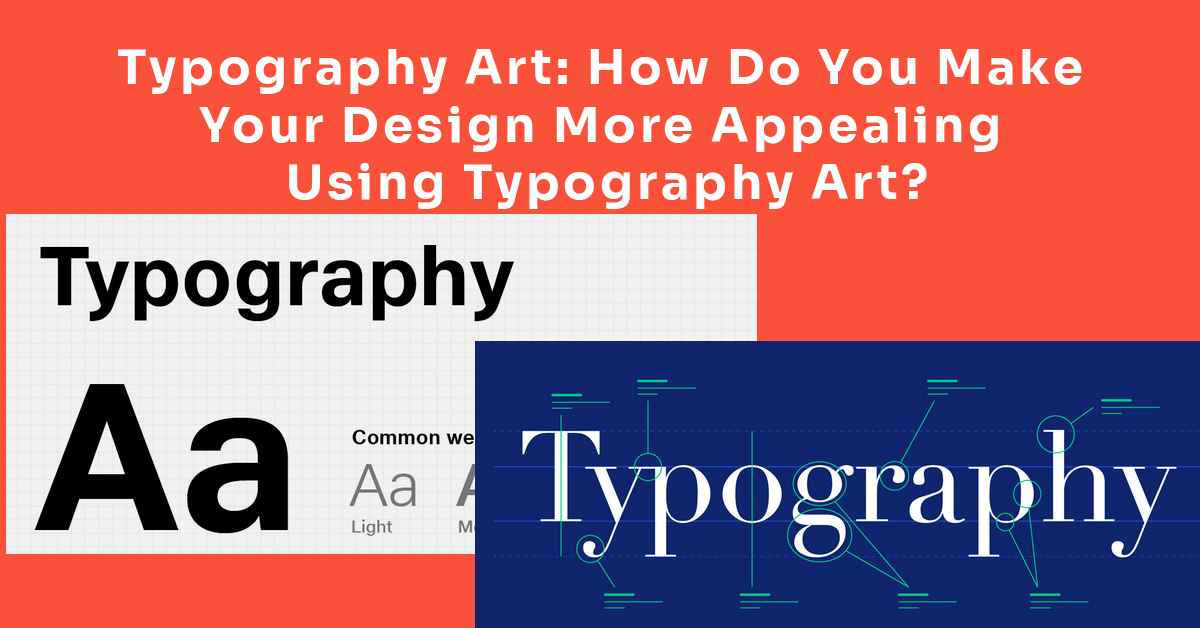
- Typography Basics: Typography is the art and technique of arranging type to make written language legible, readable, and visually appealing. It involves choosing fonts and adjusting font size, spacing, and other attributes to convey a message effectively.
- Kerning: Kerning is the adjustment of space between individual characters or letters. It ensures that characters fit together harmoniously, avoiding awkward gaps or overcrowding, resulting in better overall readability and aesthetics.
- Leading: Leading (pronounced “leading”) is the vertical spacing between lines of text. Proper leading enhances readability by providing enough space for the eye to move comfortably from one line to the next. Insufficient leading can make the text feel cramped, while excessive leading can create unnecessary gaps.
- Font Pairing: Font pairing involves selecting and combining fonts that work well together in a design. This creates visual contrast, helping to distinguish headings from body text and adding interest to your typography.
- Hierarchy and Scale: Typography hierarchy involves varying font size, weight, and style to emphasize different elements within your content. Larger, bolder fonts are typically used for headings to establish a visual hierarchy, while smaller fonts are used for body text.
- Alignment & Consistency: Proper alignment ensures that text elements are horizontally aligned for a neat and orderly appearance. Consistency in alignment throughout a design provides a sense of structure and professionalism.
- Mind the Line Length: Line length refers to the number of characters or words in a line of text. An optimal line length is important for readability. Lines that are too long can be challenging to read, while lines that are too short can feel disjointed.
- White Space: White space, also known as negative space, is the empty space between and around elements in your design. It is crucial for creating balance, focus, and a clean overall appearance. Properly utilized white space enhances readability and aesthetics.
- Consistency Across the Platform: Consistency in typography across different platforms (e.g., print, web, mobile) is essential for maintaining brand identity and ensuring a cohesive user experience. It involves using the same fonts, styles, and spacing guidelines consistently in all design materials.
Understanding and implementing these typography basics and principles is fundamental for creating visually appealing and effective designs, whether for print or digital media.
Conclusion – The Artistry of Typography Art
- Summarizes the significance of typography as a powerful design element that can transform projects from ordinary to extraordinary.
- Encourages readers to embrace typography as a means of artistic expression and a pathway to creating visually stunning and effective designs.
In conclusion, typography is the unsung hero of design, a powerful tool that can elevate your projects from ordinary to extraordinary. It’s not just about choosing fonts; it’s about understanding the principles, psychology, and artistry behind typography. By mastering typography art, you can create designs that not only communicate effectively but also captivate and inspire. So, let your creativity flow through your choice of fonts, and watch your designs transform into visually stunning works of art. Typography isn’t just text; it’s a masterpiece in the making.
If you really want to learn more about Design and want to grow your career in the design field Please join my community.